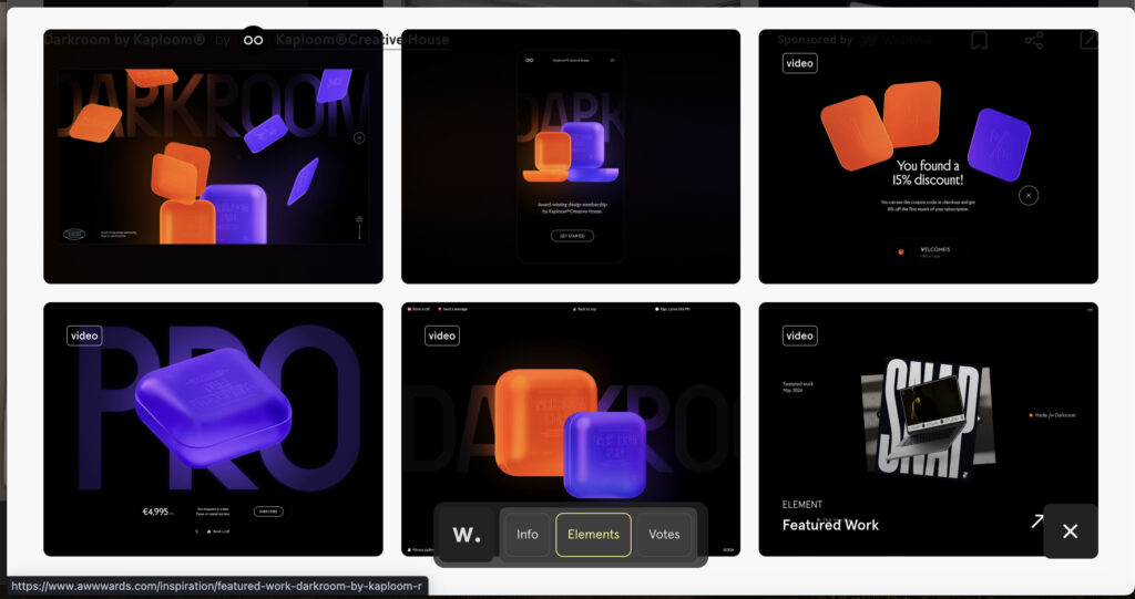
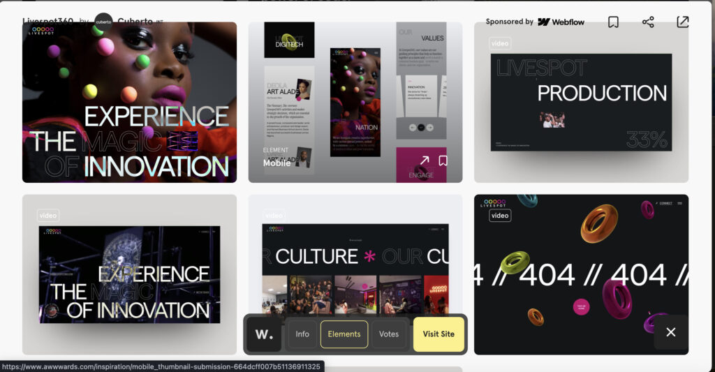
What makes these websites amazing is that they are moving away from traditional standard box model websites or maybe these sites have always been here but most people use other styles which are easier to maintain. These websites use a carousel feature, stretch images, and have a lot of their images in 3D moving text around so these sites look interactive. I elaborated on what stood out to me most with each website. They are all amazing and nothing like I have ever seen.

Vidklyk by Vidklyk site has a lot of the traditional features: nav bar, header, footer etc but then you get to the images and the box content the images that move with the page, they separate when the page goes down and come together when the page goes up. As you scroll theres a page overlay and then a white line scrolls with you as you go to the next section it leads you to what looks like a button but when you scroll six other buttons expand from inside of the one button. They also have text that comes in like a windshield wiper. This a really great website with a really great design and selection of colors.

The first thing that caught my eye was the 3D images and darkroom scrolling in the background changing colors when it got to a specific location on the screen. Then there’s this squiggly line to the right that says “more information below” letting you know that you can scroll on the page.

This is my favorite site of them all. When you first see the image it has a lot of good colors that pop out and they have very large text that contrasts to give you the important words they want you to see. They have a background that flashes different images of their fashion and shows.. Scrolling down you see traditional box model properties in the layout. They have short videos in the content box and when you click them the text of what they are shows up only to the far left of the screen and not under or by each image.
I can’t even explain the other part where you scroll the words separate and like an overlay goes over the website and shows you text then they have 3D images and as you scroll text appears on the right side after each image comes down. Truly an amazing site and they use the carousel feature vertically and horizontally. There are too many things for me to cover on this site but I am happy to have seen it.
Leave a Reply