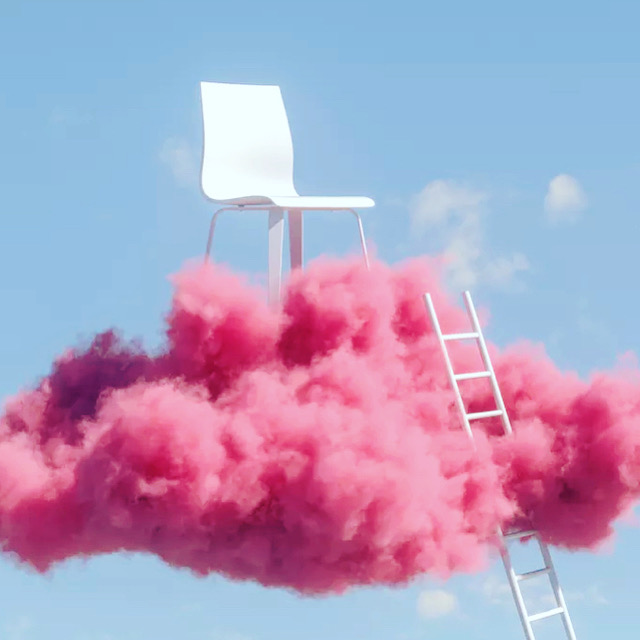
The photo I selected is one of my favorite pictures because of its simplicity.
Two graphic design principles it uses are: Figure/Ground and Symmetry/Order.
Figure/Ground because the cloud, chair, and ladder are in the foreground. Symmetry/Order because of the location of the ladder and chair, it tells you the ladder is intended for the chair.
I enjoy abstract art and this picture is the perfect definition of it. What really captures me is the pink cloud and then the chair and then the ladder to get to the chair. The image is made to be floating in the sky and the pink cloud could also be pink smoke.
Im not sure what message the photo is intended to give. “You have to climb the ladder of success to reach new heights.” if that is the intended message then it is definitely conveyed in this image. The only thing that could elevate the design would probably be some additional colors in the blue back ground to make the sky look electric.

This is a personal photo and I also selected it because of its simplicity.
The two graphic design principles it uses are Contrast and Balance.
I chose contrast because the red leaf is the intended target and the the background it neutral.
I chose balance because the brown leafs and grey ground are balance around the red leaf.
I do feel that the design is effectively communicating the intended message and the intended message is that it is fall season. I think the image is great this was a windy day and there were green broken shrubs and brown leafs falling from the trees and I happened to notice this setup on the ground. I adjusted some of the brown leaves but the picture was already setup for me.
Nothing needs to be changed or improved, I took the perfect shot!

Leave a Reply